Ever since I started working with digital photos, I’ve used Photoshop’s tools to create entirely new imagery from my photography. This is probably inevitable: with the goodie box of Photoshop toys available, who wouldn’t want to jump in and play?
But Photoshopped imagery is no-person’s land. With no rules, and no limits, accomplishment may be simply a matter of taste.
My own progression is this arena has been from early filter play, like this stylized version of a photo of a marble, with stops along the way for Warhol-like renditions of a butterfly, to more surreal and apparently photographic images like World without End and Dream Stairs. I’ve moved from seeing what Photoshop filters can do to somewhat more controlled use of layers, blending modes, and masking techniques.
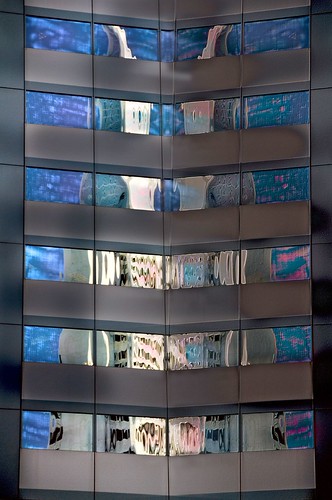
I photographed the original version of the image that decorates this story at Embarcedero Center. The photo showed reflections of the Transamerica tower vertically along the left side of the image. I duplicated the image, and combined the duplicate using Differences blending mode, a Reveal layer mask, and a side-to-side gradient to create a stylized and patterned image.
By the way, if you are interested in delving into Photoshop layer anbd masking techniques, the best book I know on this topic is Katrin Eismann’s Photoshop Masking & Compositing.

Pingback: Photoblog 2.0: » Photoblog 2.0 Archive: » In the Bag