Negative space is often defined as the space around and between the subject of an image. From a formal design perspective, learning to see negative space helps one to visualize the impact of the positive, or actual, subject of a photo. Taking this towards its limit, in some imagery the design and composition can become more about the formalism of the negative space than the positive subject matter depicted. In a black and white photo, depending upon the context, negative space is generally rendered as either all-black or all-white.

It’s possible to walk up to the second deck (about 65 floors up) on the Eiffel Tower. From there, if you want to go to the very top, you need to buy a supplemental ticket and ride the elevator. Walking up as far as one can has some visual interest, and of course avoids the lines at the bottom for the elevators.
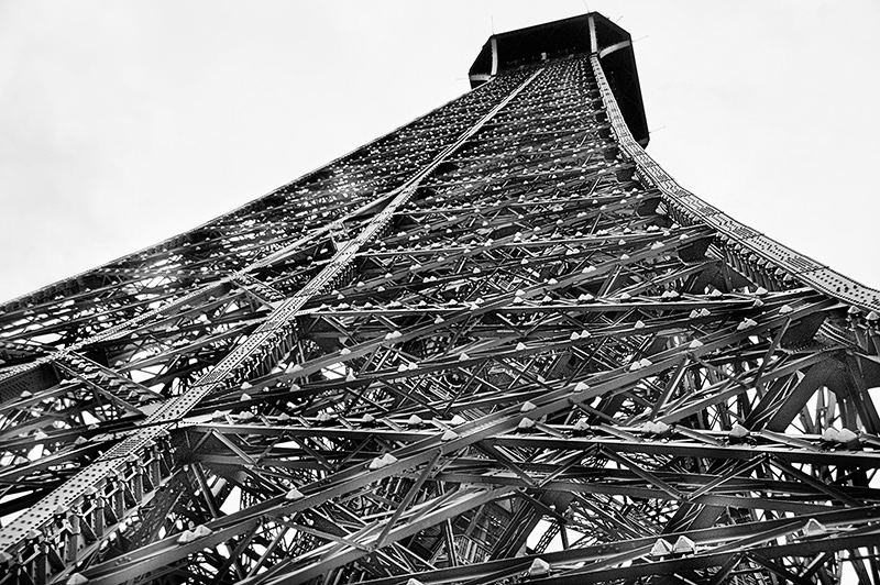
Looking up from the second deck, I composed this off-center composition. Exposing to render detail in the structure of the Eiffel Tower made the sky on this overcast day become essentially white. It was clear to me that I was looking at a photo where interaction between positive space (presumably the Eiffel Tower) and negative space (preemptively the all-white background) would be crucial (see image above).

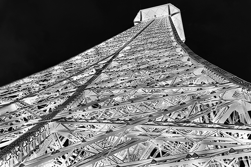
But wait! Which space is actually negative, and which is positive? White space—the sky—seems like the absence of the subject and should therefore be the negative space. It’s easy to test this presumption by swapping the L-channel values using the LAB color space. Black becomes white and white becomes black, as you can see in the version of the image immediately above.
Clearly, the inverted Eiffel Tower is spread out against the sky, which still seems like the negative space, even though it is black rather than white. But also newly made black are elements such as the night lights of the Eiffel Tower, appearing as small “chocolate-kiss” structures on many of the girders. In addition, the underbelly of the top platform now shows details as opposed to the stark negative space aspect of this underside in the original image.
These image variations show the interplay of positive and negative space—and are a good illustration of both the usefulness of looking at the world with negative space in mind, and also of how complex this interrelationship can be in the real world.